
Our logo is the letters M and FC, set together so that the swoosh of the M runs into the C. It was drawn early, by tracing a sketch point by point, and for a long time nobody looked at it closely enough to notice.
Then we added a page transition that shows the mark large in the middle of the screen. At that size the trace showed: edges that were almost straight but not quite, curves that wobbled where two traced points met. It looked like a copy of our logo rather than the logo.
Lines and circles
So we drew it again, this time from geometry instead of a sketch:
- the swoosh is made of three rings that share one centre, so its curves are exactly parallel;
- the C is a single ring, and its ends are cut along lines that point back to its centre;
- one more circle cuts the gap where the C passes the F and the swoosh, so the space between them is the same all the way round.
Everything else is straight lines. The new mark sits in exactly the same box as the old one, so nothing on any page moved — it is simply sharper, at every size.
Where you will see it
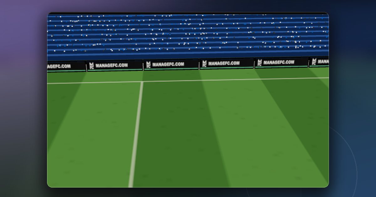
We replaced the old mark everywhere in one go: the header of the site and the game, the page transitions, the icon in your browser tab, the app icon on a phone's home screen, and the ManageFC board that runs around the pitch during a live match.
The icons are now a flat white mark on near-black. The old icon had a glossy bubble behind the letters; at the size of a browser tab it only made the letters harder to read.
You may also notice the mark in two new places. A free agent's player card carries it where a club's crest would be, because he has no club. And when a season ends, a small ManageFC seal stamps the season in the corner of the review — a little like the badge on a medal.
It is a small change. But the mark is the first thing you see on every page, and it should look as if somebody meant it.
Comments
No comments yet — start the conversation.